Display Styles visually enhance the user experience, providing the ability to configure Forms into optional sections and related information - users can then focus on data entry or access to information. Customize Display Styles to match the action (when Viewing, Adding or Editing a record) or define how to view Related information.
Available Display Styles
The following examples describe how these Display Styles can be used.
Considerations
- By default, all Forms use the Sectional Display Style
- Display Styles can be assigned based on actions
- Display Styles are created via Forms
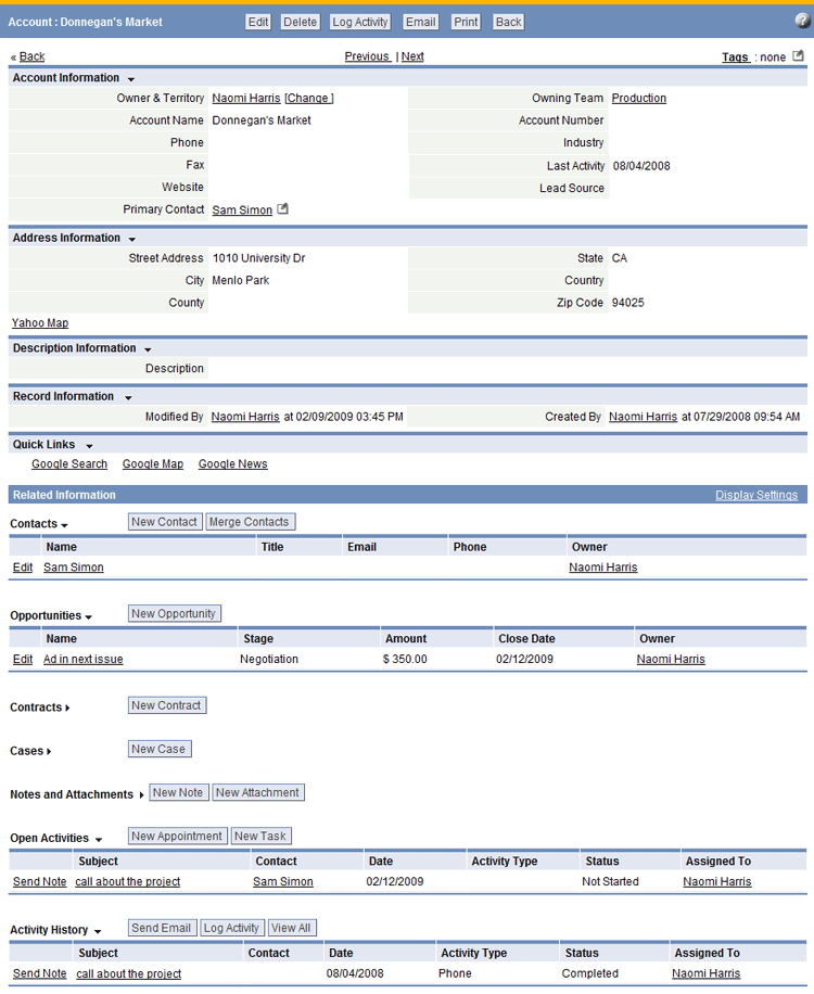
Sectional
|
|
- Displays the Basic Information, followed by Related Information sections in a full page
- This is the default display style
|
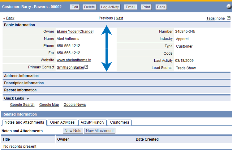
Accordion Layout
|
|
- Each section is expanded (like an accordion) when the section heading is clicked
- In add and edit modes, you can advance to the next section by clicking the Continue button
- One section can be open at any time
|
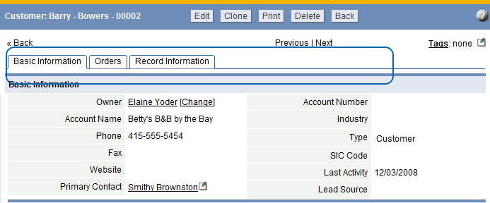
Horizontal Tabbed
|
|
- Displays sections as horizontal tabs
- Navigate to sections by clicking on a tab
|
Wizard
 Click the Previous/Next buttons to move between sections |
- Displays a single section at a time
- Navigate to sections by clicking the [Previous] or [Next] buttons
|
Vertical Tabbed
|
|
- Displays sections as vertical tabs
- Information in the first section (top section of the Form) persists in each tab
- Navigate to sections by clicking on a tab
- Sections containing required fields are highlighted with an asterisk (*)
Note: In Views, Related Information is displayed as vertical tabs, Quick Links are not displayed
|
Available Display Styles/Action Combinations
| When...
|
Choose one of these formats...
|
| Viewing a Record
|
|
| Adding a Record
|
|
| Editing a Record
|
|
| Viewing Related Information in a Record
|
|


